Great design isn’t just about making something look slick; it’s about making sure that something is intuitive and enjoyable to use. And when we’re talking about your new intranet, design can be a deciding factor in whether that intranet genuinely provides value to your organisation on a daily basis – or alternatively becomes a largely unused expense. So how do you get intranet design right?
What makes a good intranet design?
At its essence, the user should be at the heart of any design process. Your employees’ workflows, your intranet adoption rate and ultimately your employee retention rate can all be directly affected by these elements:
- Form – how visual aspects and cues influence the user
- Functionality – how the intranet works for the user, and
- Experience – how it feels to the user.
A truly great design for your organisation will be finely tuned to your organisational structure, your teams and the way they work.
However, many of the best intranet designs used across the world, and in all industries, feature simple yet powerful intranet design guidelines and principles.
In this blog post, we delve further into 11 intranet design best practices to consider.
1. Focus on the User Experience (UX)
We might sound like a broken record, but user experience is essential to design an intranet that people will actually want to use. Chances are, there are several intranet content ideas you want to incorporate into your own solution. However, one of the most important best practice tips when designing an intranet is being extremely conscious of how you choose to display information to users. Aspects such as these can be important in creating a positive user experience:
- Consistent layout, categories and style guidelines
Having guidelines in place for the classification and addition of new information will ensure your intranet remains clear, intuitive and user friendly over time.
- Descriptive labelling
Using simple and familiar terms like Help Desk instead of I.T. makes it fast and easy for employees to find what they need, and more so when displayed with clear icons.
- Clear calls to action (CTAs)
Clear CTAs can initiate interaction on the intranet and prompt employees to take logical next steps. No one is left wondering what to do, or where to go next. For example, if you want the user to click to read more details about a news article, have a CTA that says 'read more', instead of hyperlinking the image used and assuming users know they should click on the image to read more.
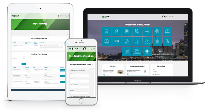
STAR Group’s intranet makes key processes easy to find and follow.
It’s also vital to consider the UX subset of intranet usability, which refers to how easy the system is to use as employees go about their important activities. Great usability isn’t typically noticeable – but poor usability will be impossible to ignore! Usability can encompass:
- How easy it is for employees to use the intranet for the first time, or after a long absence
- How efficiently employees can perform their key tasks using the intranet
- Whether common errors can be navigated or eliminated, and
- The level of satisfaction that employees feel with the intranet.
Need more insights? Check out the recording of our webinar 'How to Improve Intranet Design, UX and Engagement'.

2. Guide Users Using Visual Design
It’s estimated that 90% of the information transmitted to the brain is visual, which is why visual design can have a profound effect on ease of use. A few ways you can enhance your intranet's design include:
- Choosing layouts, colours and graphics that suit the company culture and internal branding. If your intranet has a name, this can help to shape visual elements.
- Deciding on the right intranet dashboard that will present the information that a user actually needs.
- Organising your intranet through visual hierarchy can make your content more readable and guide users; for example, by giving more visual weight to particular elements.
- Using icons and images supported by clear and concise text to provide faster communication to users.
- Incorporating visually dynamic content like videos and images, which can help you deliver key messages to staff.
- Providing a virtual tour which can help first-time users familiarise themselves with the visual and navigational aspect of your intranet. This feature can be turned off as needed.
Need more inspiration on intranet design? Explore our successful intranet design examples to find out more about how you can maximise the usability of your intranet.
3. Put Extra Thought into Navigation
The old adage ‘less is more’ applies well to intranet navigation. Rather than overwhelming users with a massive list of pages that all look the same, it’s best to keep top menus to a maximum of seven options and use sub-menus to good effect, prioritising commonly used links.
Mega menus are a popular choice for some companies and can be ideal for intranets with a lot of links. They may not be suitable for every application, though, so your intranet provider can provide advice on whether it’s right for your needs. Ensure your dropdown menus appear in low key and do not overpower the main content on the page.
Once again, visual hierarchy can help to distinguish the most important information on menus, and you can even personalise navigation menus for particular users, teams or departments so they can easily find their most relevant links.
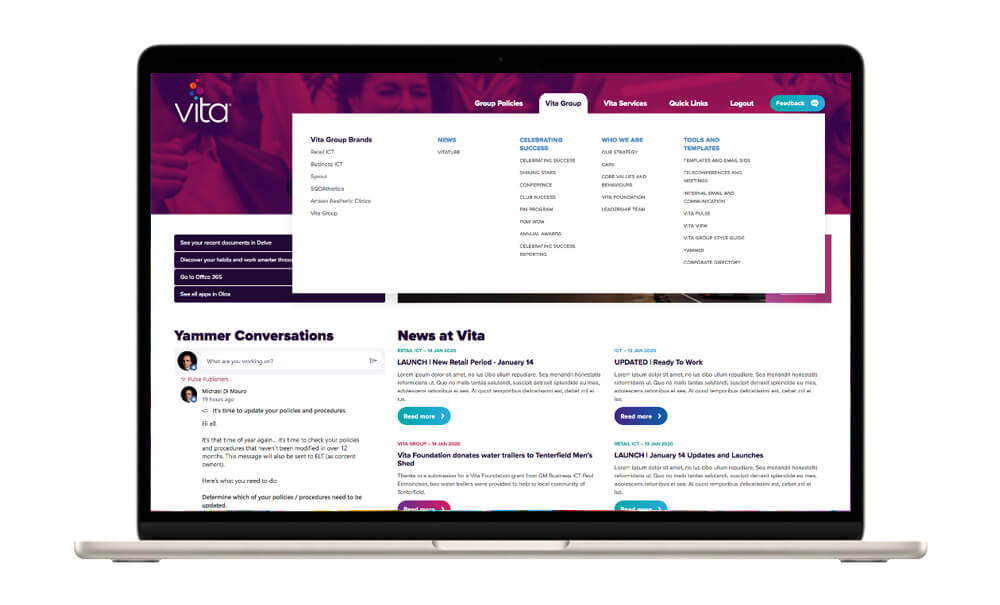
Vita Group’s intranet uses a mega menu to structure the vast amount of information that exists
4. Leave Room for White Space
White space not only makes your intranet look cleaner; it’s also a functional aspect as it makes it easier to scan and read content.
Readability is a big factor when it comes to efficient workflows. So embrace that white space, and you might feel like you can breathe a little deeper each time you open up your intranet.
5. Choose Complementary Colours that Reflect Your Brand
Ideally, two colours that complement each other and are significant to your organisation’s identity will make it easy for your staff to recognise and relate to your new intranet platform.
You could potentially add another neutral colour that acts as an accent to your intranet design. It’s also important to use colours that will continue to be pleasing over time; so neon tones are out!
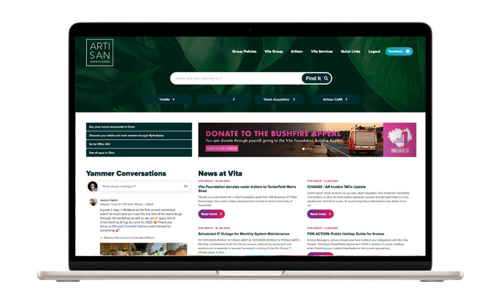
Vita Group’s intranet incorporates key colours for each brand with ample white space. Each employee has a personalised view, with the colours reflecting the brand they work for.
6. Keep Your Backgrounds Clean
A clean, solid background that complements your brand’s design language will make it easier for you to highlight important headlines, sections and content.
Too many changes in the background and you’ll have employees scratching their heads. Gradients can affect readability and clutter the page, so it’s best to choose solid colours for a modern yet timeless design.
7. Use Consistent and Readable Fonts
Legibility aspects such as typography, alignment and spacing should be considered and consistent throughout your intranet. This will improve readability, which can be a crucial factor for speed of operations and a seamless workflow.
Most people are now accustomed to seeing sans-serif fonts on their screens, while serif fonts can offer slightly better readability if passages of long text are necessary.
8. Arrange Content to Break the Pattern
The way content is organised will significantly affect user experience, which is why it’s so important to have content that flows. This means breaking up longer text into shorter sections or blocks.
A mixture of text and images will ensure that the user won’t be scrolling through lines and lines of text, while other design elements such as dividers, bullet points and subheadings can help to break up large text blocks and guide the user. Tables are also a great option to make content less complex and easier to skim if needed.
9. Use Integrated Tools Wisely in Your Intranet
A stunning interface won’t help your users if they still don’t have the tools they need at their disposal.
When designing functionality, consider whether existing tools such as MS Office, Google Drive and Slack could be best integrated into your intranet’s design.
Integration provides both a consistent user experience, and will help to ease the transition to a new intranet platform. Having an ecosystem where tools can talk to each other seamlessly saves a lot of time for all parties involved.
10. Prioritise Cccessibility
Accessibility refers to the practice of making your intranet usable by as many people as possible, across all ages, locations and abilities.
Thinking about where and how your employees may use the intranet can shape your decisions in a number of ways. Your intranet should be accessible seamlessly across desktop, tablet and smartphone. Any third party integration should be available and accessible through just one intranet log-in.
It’s also important to think about visual design choices and accessibility. Colour and contrast choices can make a huge difference to those with limited vision and reducing eye strain over long hours on a computer. Other systems will enable users to easily change font sizes to suit their preferences.
11. Assign Access Levels Within Your Intranet
Selective access in the digital workplace is a top priority for most organisations. You wouldn’t want all information to be available to all people in the business. This is why Elcom’s intranet design already includes a security permissions feature.
In the case study of Australia’s top bedroom retailer, Forty Winks, the retailer now has the ability to set seven different access levels within their intranet based on the user’s level of authority. Information can be updated easily and instantly for all relevant users, with little IT knowledge required from the administrator.
Great intranet design will help you to attract, retain and engage your employees, but you might be wondering how to design an intranet site that meets your organisation’s specific needs.
Here’s where expert guidance comes in. Of the organisations named in Nielsen Norman Group’s top intranets awards, 6 out of 10 sought help from reputable agencies or consultants to launch their new digital workplace.
Related reading: [Blog post] 6 Things You Should Be Looking For in Your Intranet Provider
Further Resources
Following these intranet design guidelines will help you ensure you deliver an intranet that people actually like using. However, it is not the only aspect you need to consider.
Intranet design is fundamental to the success of an intranet. But the same easily-made mistakes often end with an inadequate, expensive and cumbersome platform with low adoption rates.
Get the design and build right for your intranet, the first time around. Watch the on-demand webinar and discover what it takes to design a successful intranet.