The intranet solution you’re considering may tick the boxes for the features you need, but is it intuitive enough for your staff to use?
In far too many cases – and despite their best intentions – many organisations find that a new solution and the intranet experience is actually hindering staff rather than helping them.
Significant thought should be going into implementing intranet usability guidelines to ensure that the user experience is a core component of your the intranet design principles guiding implementation.
These are the top five critical aspects of an intuitive intranet system.
Why User Experience Design is Critical for Intranets
The user experience design for intranets is critical because it directly impacts employee productivity, engagement, and satisfaction. A well-designed intranet can significantly reduce the time and effort required for employees to find the information and tools they need to perform their jobs effectively. In contrast, a poorly designed intranet can frustrate employees, leading to disengagement and decreased productivity.
User experience design also plays a crucial role in improving digital workspaces and encouraging employees to adopt new technologies and processes, both of which can lead to improved efficiency and innovation within the organisation.
1. Optimise Search for Easy Access to Information
If there’s one common bugbear of intranet systems, it’s the difficulty of finding necessary information when needed. This largely comes down to navigation and search capabilities.
A fast and accurate search function can have extraordinary effects on productivity. Having a record of searchable knowledge has been found to decrease the time workers spend looking for information by 35%.
When assessing an intranet’s search function, three key considerations often arise.
Best Bets
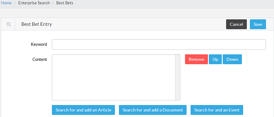
The ‘best bets’ feature allows you to overrule the usual weighting of search results in order to show pre-set results that will be most useful to the user. For example, a staff member searching for ‘annual leave’ will likely be looking for the policy or the application form before other references further down the list. Best bets can be set by an administrator, or set automatically when a particular search regularly results in visits to a specific page.
Spelling and Variations
Not all minds think alike, and you can assume that there will be misspellings, incorrect capitalisation, variations and mistyped searches within your intranet system. A strong search function will be able to auto-suggest correct spellings for these search enquiries and help the user to find the results they’re seeking. Analytics on failed searches can be used to pinpoint any recurring issues.
Boolean Searches
People often use Boolean search modifiers such as ‘and’, ‘or’ and ‘not’ to narrow down within their searches in Google, and many will use these modifiers within their workplace intranet system too. A quality digital solution that prioritises intranet user experience will be equipped to use these terms to deliver better tailored results to the end user.
2. Design Intuitive Menus and Navigation
The usability of a menu must be addressed in order to deliver a great digital employee experience. The menu will house the intranet's search function, meaning these navigation best practices need to be considered. Signposts must be clear, consistent and predictable to optimise your staff’s intranet experience. Consider the following menu factors when assessing an intranet’s usability:
Menu Design
- Choose horizontally designed menus over vertical menus, which can take up valuable page space and potentially block useful information.
- Use vertical menus only when they are appropriate on specific pages and sections.
- Make use of visual icons in menus, if possible, that are easy to recognise and remember in order to aid the user experience.
Menu Structure
- Keep key menu navigation simple, as short term memory is said to be limited to around seven items.
- Consider using mega menus if you need to present a large amount of links, so you can separate those links into distinct categories.
- Use tailored page access to simplify menus for the end user and avoid information overload.
- Keep menu structures consistent across the system.
- Assess whether it is beneficial to structure menus by department, by task or both for the organisation. The conventional option of structuring menus departmentally, for example, can potentially lead to missed information or even duplication of work if employees can’t access important data.
Menu Orientation
- Consider where the menu will be most effectively located for the intranet system in terms of left or right hand orientation, and how easily users can find and access the menu option when it’s not in use.
A Real World Example
Vita Group, a publicly listed leading Australian retailer, put a lot of effort into the design for their menu when redesigning their intranet, Vita Pulse.
Some key components:
- The use of a mega menu to present large information in categories grouped according to the needs of end users.
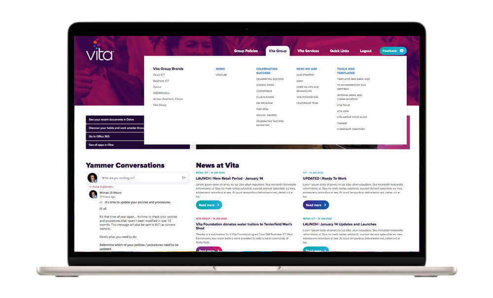
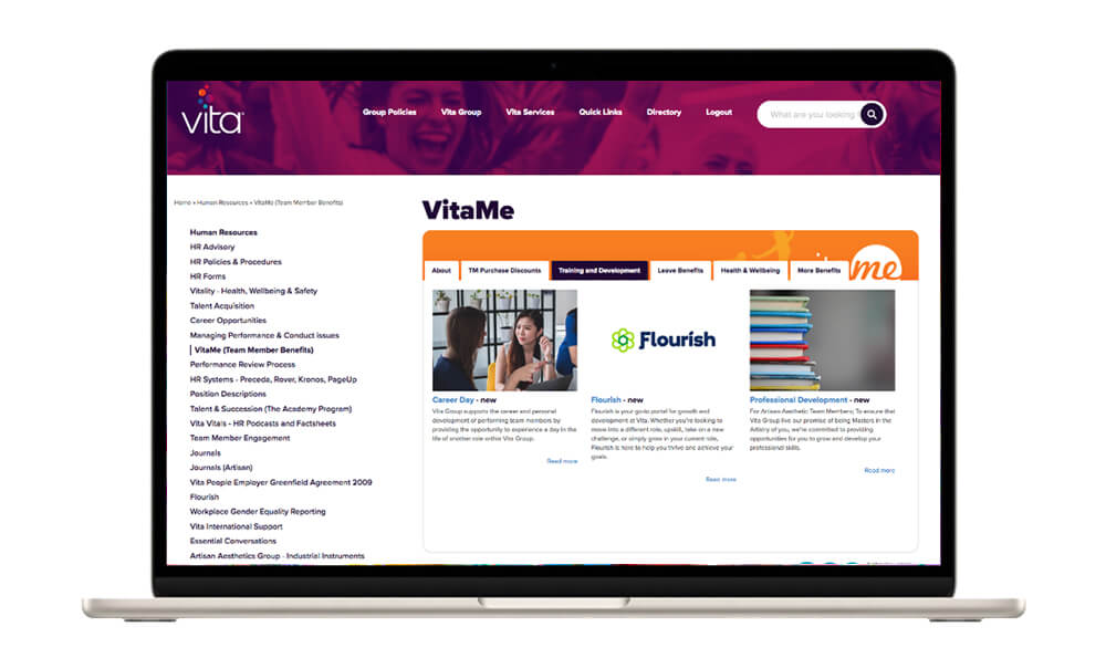
- A vertical menu on select sections that appear when employees are viewing the information on large screens. This makes it much easier for staff to navigate. The example below also showcases their 'topics to a page', which presents a lot of additional content in a nicely formatted way, with their own sub-menu headings.
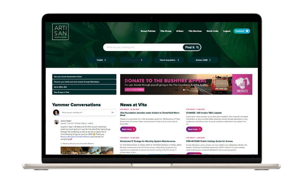
- Each menu is personalised according to the brand the staff member works for. In the example below, the intranet view (and menu) for staff working for the brand Artisan is different from the example screenshot above which showcases the view for corporate staff.
3. Implement Accessible Navigational Features
It may seem simple, but several key navigational tools that follow intranet design best practices can make the difference between an effective intranet and one that won’t be used. Consider the following:
- Quick links can be invaluable when it comes to staff easily finding top features, such as annual leave applications or WHS policies.
- Quick links can also provide a fast and easy portal to commonly used third party services, for example an external CRM such as Salesforce.
- Breadcrumbs such as Home > Policies are an ideal way of showing the intranet site’s hierarchy and can help users to navigate back to the last useful link they visited.
Want to learn how to make your intranet more accessible for all employees? Download our free guide to intranet best practices today and discover how to improve your intranet usability by implementing accessible navigational features that improve user experience for everyone.
4. Implement Top-Down Personalisation
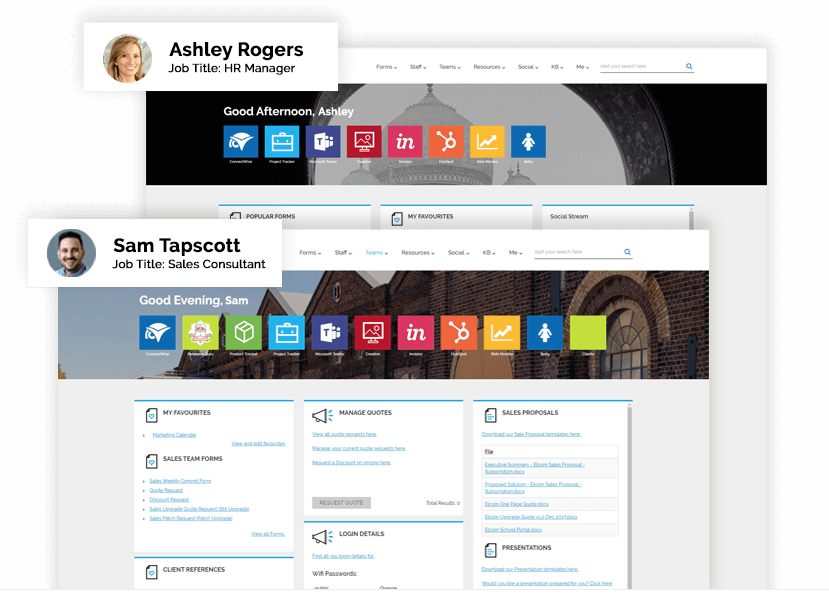
Personalised intranet experiences are especially invaluable when it comes to optimising intranet usability for certain departments.
An intranet solution should allow you to tailor homepages, navigation and content for groups of users: for instance, showing distinct and relevant content to frontline workers, the sales team and to head office staff.
Personalisation trends in intranet design include using data analytics to understand user behaviour and preferences, implementing intelligent search capabilities, and incorporating social collaboration features.
This personalisation minimises the risk of information overload and can drive staff engagement with the information they are shown.
5. Enable End-User Personalisation
Given the choice, many employees would warmly welcome the chance to organise their intranet homepages individually in order to streamline their workday. This provides flexibility for staff to work their own way towards achieving organisational goals. For effectively personalised homepages, staff should have the option of:
- Customising their homepage layout and hierarchy; for instance, choosing five sections or company Intranet features to add to their Favourites panel.
- Subscribing to alerts or newsfeeds about a specific topic or task, so they can receive real-time notifications when relevant content is updated in the system.
An effective intranet user experience requires a well-structured solution that is tailored to the user and their objectives.
The best design is invisible – that is, the intranet experience should work so smoothly that the user won’t need to pay attention to the platform or its design. It’s important to watch demos and test platforms as much as possible before committing to a solution to determine how intuitive, pleasant to use and reliable the platform will really be.
After all, the true test of an intranet and its user experience will be in the daily interactions for your team.
Creating a Consistent and Cohesive User Experience is Key
When it comes to improving your intranet experience, it is important to establish a set of design guidelines and stick to them throughout the entire process. This means using consistent internal branding, typography, and colour schemes, and ensuring that all elements of the intranet are visually and functionally cohesive.
It is also a good idea to consider the user journey and ensure that all aspects of the intranet are intuitive and easy to use. A consistent and cohesive user experience can help to reduce confusion and frustration, and ultimately increase employee engagement and productivity.
By putting in the effort to create a well-designed and consistent intranet, you can ensure that employees have a positive intranet user experience and are able to access the information and tools they need to perform their jobs effectively.
Maximise Your Intranet with Best Practices
An intranet can be a powerful tool for improving communication, collaboration and productivity within your organisation. However, to maximise its potential, it’s essential to adopt best practices to ensure a strong intranet user experience.
If you’d like to improve your intranet usability, read our comprehensive guide to intranet best practices today and learn how to optimise your intranet for maximum productivity and engagement.
Related Resources
