Previously, we touched on the use of colour in web design and how certain colours can be used to evoke emotional response in the visitor. This time we’re going to be looking more closely at how this is used and what colours your business should be using to ensure that your site gets the right message across. It’s important for businesses to understand that every element on a page should be considered when it comes to colours used, as not only do they convey a brand’s message quickly, but they can prompt users into making those all-important conversions.
According to Kissmetrics:
“When our eyes take in a colour (sic), they communicate with a region of the brain known as the hypothalamus, which in turn sends a cascade of signals to the pituitary gland, on to the endocrine system, and then to the thyroid glands. The thyroid gland signal the release of hormones, which cause fluctuation in mood, emotion and resulting behaviour (sic).”
So science tells us that the use of colours that evoke negative feelings, or even mismatched ones, is going to have a bad effect on the visitor and could encourage them to abandon the site.
Kissmetrics goes on to point out that according to a study, it takes just 90 seconds for a potential customer to form an opinion on a site and “62-90% of that interaction is determined by the colour of a product alone.”
So colour’s important. In fact, it pays to study psychology in design all round when planning a new website, as the language, the font and typeface and the spacing you use are all ingredients that can influence a visitor through psychology.
What Colours Convey
Below is a brief overview of what colours convey:
- Red – prompts action and speeds up the pulse and heartbeat. It’s also associated with passion and danger.
- Green – promotes a sense of well-being and of being connected to nature.
- Blue – inspires trust and deeper blues are often found in luxury brands. Lighter blues convey a sense of a refreshing and innovative product and it’s an extremely popular choice. It’s thought that blue suppresses the appetite so it’s not to be used in food sites or ads.
- Yellow – is one of the least popular colours and is often associated with danger. Brands should avoid yellow, especially in niches that are targeted at men. Kids, on the other hand, love it.
- Orange – is associated with warmth and energy and is highly popular, especially as a replacement for red.
- Pink – should be used sparingly and is associated with girlyness and babies.
- Purple – is loved by women and hated by men. It’s associated with luxury and elegance.
- Black – is all about class and is often used by high-end brands in the automobile niche.
- White – is a calm colour associated with modernity.
Women love the colours blue, purple and green the most and dislike grey, orange and brown, whilst men like blue, green and black but dislike brown, orange and purple. This would suggest that when thinking about colours on your site, you should avoid browns and oranges (although it’s worked for Amazon) and go for blues and greens if you’re looking at a cross-section of sexes in your demographic.
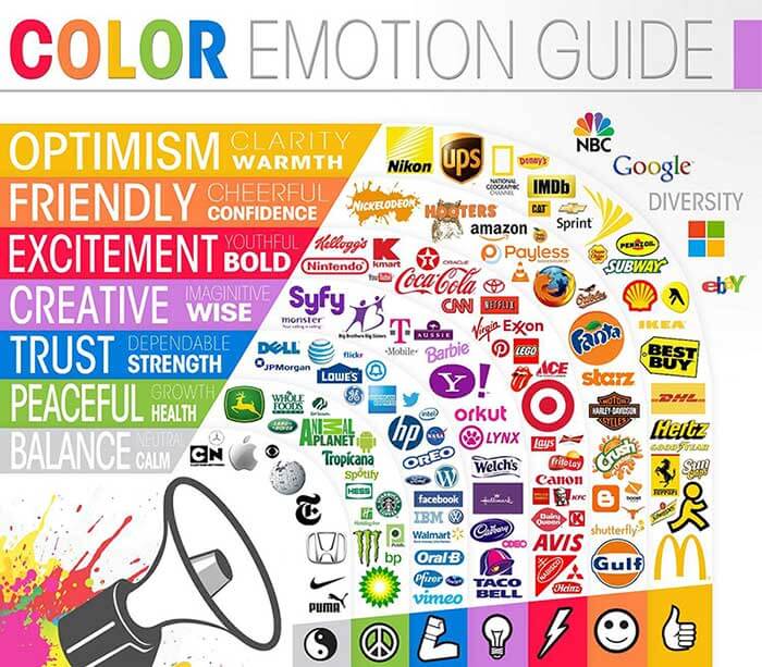
Click to enlarge. Image credit: The Logo Company
Be Led by Colour Choices, But Not Too Much …
Whilst it’s true that colour affects decisions though, it’s important that you also understand that it’s not an exact science as we’re all individuals and react differently. You should pay a lot of attention to colour when it comes to branding and to CTA buttons, but it’s also a good idea to carry out A/B testing to fully test on your audience as they can and do sometimes surprise you.
However, you’ll often see the big brands using colour in such a way that it suggests that they use colour psychology too. For example, banks and other financial institutions often use a darker blue due to its associations with trust and professionalism, whilst those associated with the environment will almost always use greens. It’s rare that you see an all red, in your face website, even though you may see the logo and CTAs being red. Further to this, we naturally look for colours that ‘fit’ the brand and so large brands in your niche will use the colours that you want as this means that your audience will immediately see that the colours used are a good fit.
Research has found that it’s important to try to predict how well colours will be associated with your brand and products in order to arrive at a good approximation. With this in mind, when it comes to the time to plan for the new site, you should look at brand and buyer personas in order to brainstorm and make some accurate predictions.
Think About the Overall Effect
It’s vital too that when planning, you think about the overall effect that the site is going to have. The use of strong colours demands a fair amount of white space and the use of neutral colours throughout the site so that the user isn’t overwhelmed. If red makes your pulse race, then it would seem like a good idea to use it on CTA buttons, for example, but not all over the site.
Likewise, if you’re using a lot of dark blue then it’s unlikely that the whole site will use it and you will use whites and greys for back drops and text. Careful consideration, split testing on important landing pages (and even on product pages) and a good choice of font and the use of spacing are all equally important to the overall feel of the site.
Colour in design is a much discussed issue and whilst it’s proven that it works, there’s no hard and fast rules aside from taking the emotions that colour evokes as a guideline. Do this for logos and branding above all else, and think hard about how you present these and CTAs and you should come up with a site that’s perfect for your business.
Fail to understand the role that colour plays and playing up to your own personal preferences can have a counter-effective result, so leave your favourites at home where they belong and consider where colour fits into your branding.