We’ve given our website a complete overhaul – new site architecture, content and images wrapped up in a cleaner look and feel!
What we did
With every redesign, we move towards more of a minimalistic design, allowing you to easily navigate through the web pages, without being distracted by clutter. Immediately you’ll find clear navigation, simplified sub folders, streamlined menus, elegant search functionality and a responsive layout.
We know you’re busy and want access to information quickly, so we’ve removed unnecessary and repetitive content and introduced more white space into the new design - giving you room to breathe between elements on the page, making it easier to scan content. We've also used subtle background graphics and transparent background colours to separate different sections from the page, but make it easier on the eye to navigate down the page.
At the same time, we've featured bold and visual graphics on the main navigation pages to grab the visitors attention, and create consistency across different sections.
Diving a little deeper
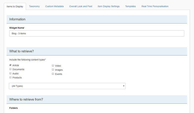
From a more technical perspective, a lot of the website is now taxonomy-driven dynamic content, thanks to widgets.
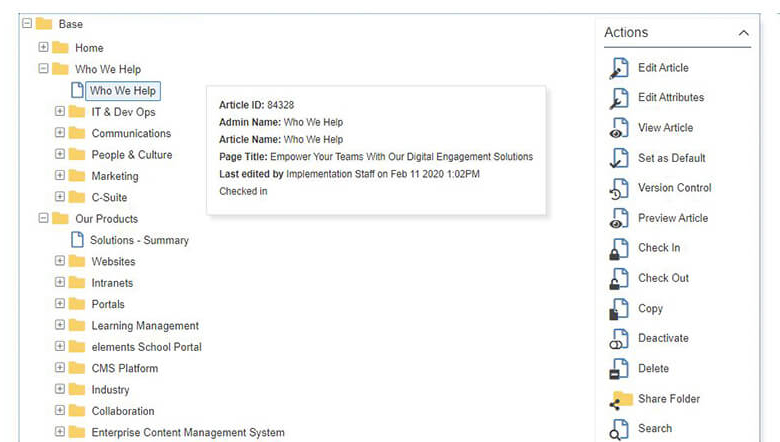
Backend Interface
We've cleaned up our backend folder structure, which mimics the navigation menu, making it really easy for non-technical publishers to manage and discover where content is hosted.
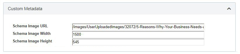
Schema markup
We now mark up our articles (aka webpages) with additional schema markup since as thumbnail URL and image sizes, along with standard meta descriptions, to allow them to appear as rich snippet in search results.
This is all done via the user-friendly admin interface to help our non-technical users make these updates.
Acknowledgements

For select visitors we display a message to help them understand that we use cookies.
This makes it easy for visitors to consent to using their data (to assist with GDPR compliance).With Acknowledgements, you can request consent from visitors to accept your terms and conditions or use of cookies to assist with GDPR compliance. This is also linked to detailed reporting and tracking of acknowledgements.
Taxonomy and Dynamic Widgets

At its simplest application, dynamic widgets can be used to quickly and automatically create news, blog, case studies and other resources feeds, lists of documents, gallery of images and libraries of assets. Each widget can be customised by how it displays, the look and feel and so on.
We then combined it with Elcom's taxonomy feature, which is used to create and tag content. This enhances the power of dynamic widgets to filter, refine and browse dynamically pulled content based on the tags.
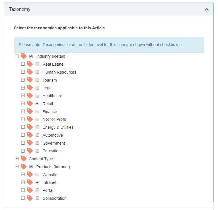
Why is taxonomy so important? As each of our website visitors brings their own set of unique needs and requirements with them, we’ve realised not all content, specifically connectors, modules and case studies will be of interest to everyone. Taxonomy enables us to offer category filtering on our website. This in turn enables you to filter by solution and/or industry to show only content relevant to your needs. Now you can view, for example, learning management case studies, instead of all case studies.
Moreover, if you prefer to see all categories and solutions, but are still interested in understanding what category or solution a module, connector or case study falls into, simply hover over each option.
What next?
As we like to remind our readers – the words ‘set and forget’ and ‘website’ do not go together. Your organisation, industry and audience evolve over time, and your website should evolve with it. In light of this, we’ll be constantly testing, optimising and updating the website, with a focus on the design and content elements.
In the meantime, we would love to hear your feedback. Is there anything else we can do to improve your experience on our website? Simply email [email protected] with your feedback.